Introduction: Why Data-Driven Map Graphics Matter in Live Broadcasts
In today’s world of high-impact broadcasting, map graphics are a unique and impactful way of storytelling. Whether you’re covering elections, weather patterns, or economic trends, color-coded map powered by live data transforms dry numbers into intuitive visual experiences.
From newsrooms to sports broadcasters, dynamic vector map graphics are fast becoming the gold standard for delivering information-rich, visually stunning stories.
Most contemporary graphics software is not designed to handle map-based graphics and even if it is, demands hefty money. These graphics involve complex data that needs specialized management. The software must be capable of processing large datasets in real time. It should also update the visual display instantly as the underlying data changes.
Without these capabilities, the map cannot show accurate or live information. Therefore, creating map graphics requires specialized software (WASP3D Xpress- (Free Forever)) that can manage data efficiently and render real-time updates smoothly.
One of the most popular and powerful examples?
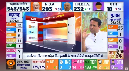
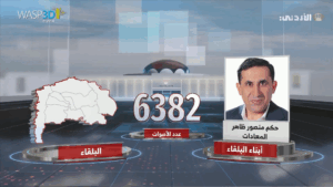
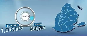
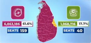
👉 Election result maps — where each region lights up with the color of the winning political party, changing live as votes are counted.
In this hands-on guide, we’ll show you exactly how to create such a map graphic using a free live graphics software and one of the most flexible real-time graphics engines in the industry.
Let’s get building.
Step-by-Step Guide: Building Map Graphic (Election) in Wasp3D Xpress
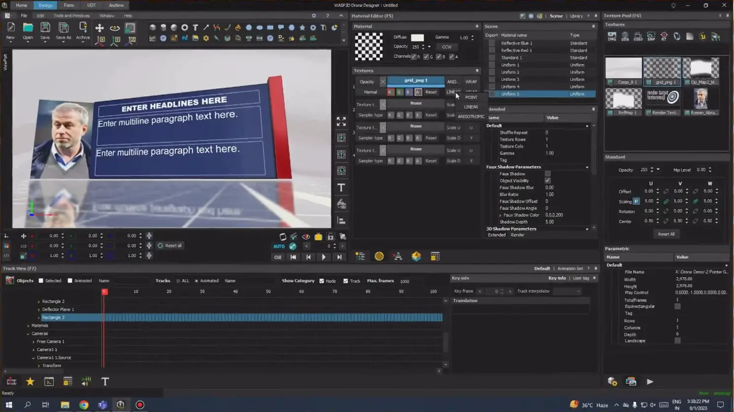
Part A: Converting Vector AI Map into UDT in Wasp3D Designer
Start by importing your AI file into a scene template that already has a reflected floor and basic materials. Make sure your AI file contains individual vector shapes for each region.
Next, open the Parameters Pool (F4) to adjust the fill and color settings of your shapes as required.
To bring the 2D shapes into 3D, use the Extrude tool. Set the radial segments to 1 to keep the shapes clean, and adjust the Z-axis to define the depth.
Once extruded, open the Material Pool (F5) to customize the surface materials for your regions.
After material adjustments, group all your shapes together. Add the group to a Render Texture to enable a floor reflection effect.
Finally, right-click on the grouped polygon data and convert it into a UDT (User Defined Table). Name your UDT appropriately. You will now see fields like region name, visibility, color, and row number available for dynamic control under the UDT tab.
Part B: Creating Data Tables for Party and Result Mapping
First, create a Party Info Table with essential columns: Party Name, Short Name, and Party Color.
Then, create an Election Result Table where you define State, Winning Party (set as a dropdown linked to Party Info), and Color (which will fetch dynamically based on the selected party).
Establish relationships between these tables, so when a Winning Party is selected, the corresponding color and short name are automatically populated. Full names can be kept for backend management, while short names are displayed in the graphics.
Make sure the Color field in the Result Table is correctly bound to the Party Info color. This ensures instant color synchronization across the graphics.
Once the setup is complete, save the tables and test the configuration through the Data Entry tab by entering some sample results.
Part C: Connecting Data to Visual Regions
Switch to the Design tab and open the Variable Sheet to load your saved UDT. Set Rows per Page to “All” for full access.
Now, for each state shape, link it with the Election Result Table by dragging and dropping the table fields onto the corresponding UDT fields.
Finally, set the column mappings. Bind the Color field in the UDT to the Color column in your Result Table. Visibility settings can be optional based on your design needs.
Once mapped, your map regions will automatically update their colors in real time based on election results.
Final Result: A Live, Color-Coded Election Result Map
You now have a data-driven map that:
- Reflects real-time changes in party leads
- Highlights each region with live color mapping
- Supports error-free operator input with dropdowns
- Can be reused and scaled for future events
Other Broadcast Scenarios for Data-Driven Map Graphics
Don’t stop at elections — this technique works across genres with similar processes:
1.Weather & Disaster Coverage
- Rainfall zones, cyclone paths, temperature map graphics
- Live heat maps for flood or fire alerts
2. Health & Pandemic Graphics
- Region-wise case counts or vaccination progress
- Hotspot tracking or recovery zones
3. Business & Economics
- GDP or employment data by regions
- Region-wise performance in sales or stock markets
4. Sports & Entertainment
- Region-wise fan distribution
- Match venue stats or viewership heatmaps
5. Conflict, News & Social Issues
- Protest locations, relief operation zones
- Migration tracking or regional alerts
6. Education & Learning
- Animated historical boundary changes
- Literacy rates or exam performance by region
Live Streaming & Production Platform Compatibility
Conclusion
Data-driven map graphics are a powerful way to visualize complex stories — whether you’re showing who’s winning where, where the storm is heading, or how a crisis is spreading.
Using Wasp3D Xpress (Free Forever), you can build automated, dynamic maps that don’t just look good — they perform flawlessly under the pressure of live broadcasting.
Want to get started faster? Download Xpress in just a few clicks.
Frequently Asked Questions (FAQs)