Static numbers are boring. 3D visuals? They’re magnetic. Today, livestreams have become one of the most powerful ways to connect with audiences — whether it’s news broadcasts, esports tournaments, business webinars, or live events.
But in a world filled with endless content, how do you make your livestream stand out?
One proven way: real-time data graphics.
Dynamic visuals like live bar graphs, scoreboards, and data charts instantly capture attention, simplify complex information, and add a layer of professionalism that keeps viewers hooked.
Live data instantly gives your audience something to react to, connect with, and remember.
In this blog, we’ll explore why real-time data graphics matter, how to use them effectively, and how you can bring your own broadcasts to life.
What You’ll Learn in This Guide
- Create bar graphs for your livestreams in under 5 minutes
- Add real-time data updates without technical complexity
- Use professional-quality visuals for YouTube Live and Facebook Live
- Avoid common mistakes that make live graphics look unprofessional
- Build engaging, dynamic visuals that keep viewers watching longer
Why Bar Graphs for Your Livestreams Matter More Than Ever
- Fast-paced live environments
- Audience-driven content like polls and voting
- Competitive formats like esports and sports streams
Why Real-Time Graphics Are a Game-Changer for Livestreams
When audiences tune into a livestream, they expect more than just a talking head or static screen. They want storytelling, visual excitement, and real-time updates — all delivered seamlessly.

Real-time graphics:
- Simplify complex information: Instead of explaining numbers verbally, you show them visually.
- Build trust: Real-time updates make your broadcast look credible and transparent.
- Increase engagement: Moving visuals naturally draw the human eye — leading to longer watch times and better retention.
- Differentiate your brand: High-quality graphics set you apart from amateur broadcasts.
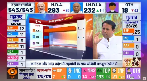
From newsrooms announcing election results to esports broadcasters displaying live player stats, real-time data graphics have become a must-have for professional livestreaming.
Why Bar Graphs Work So Well On-Air
Among all types of live data visuals, bar graphs are especially effective. They’re instantly understandable — viewers can quickly compare values at a glance.
They’re also ideal for showing change over time, making them perfect for elections, sports, financial updates, polls, and competitions. Plus, they animate beautifully. Smooth transitions and growing bars add energy and drama to the broadcast without overwhelming the viewer.
Imagine a live election night — the votes are being counted, and instead of static numbers, you see colorful bars growing dynamically as the results update. That’s the power of a well-designed live bar graph.

Common Mistakes to Avoid with Live Bar Graphs
While bar graphs are simple in concept, a few mistakes can ruin the viewer experience. Cluttered visuals caused by too many categories can confuse the audience.
Overly flashy animations might distract rather than enhance the data. Poor color choices — such as too many random or clashing colors — can reduce readability.
And slow data updates, especially in live scenarios, break viewer trust. Keeping your visuals simple, consistent, and dynamic is the key to success.
Best Practices for Stunning Live Bar Graphs
If you want your bar graphs to truly shine:
- Focus on key metrics only: Highlight the most important comparisons.
- Use brand-aligned colors: Maintain a consistent visual identity.
- Keep animations smooth and quick: Fast enough to feel dynamic, but slow enough to be readable.
- Test on different screens: Make sure your graphs look great on both large monitors and mobile devices.
How Wasp3D Makes It Effortless
Creating professional-quality, real-time bar graphs might sound complex — but with the right tools, it’s incredibly simple.
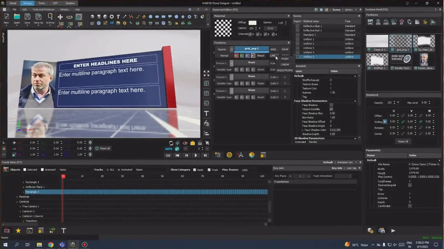
Wasp3D Designer allows you to build stunning bar graphs that animate in real-time, integrate live data feeds effortlessly, and customize everything from colors to transitions — all without heavy coding. It’s broadcast-grade output with no lag, no compromise.
And with WASP3D Xpress, it’s not just easy but completely free to do as well.
We’ve even created a quick tutorial showing how easy it is to design a dynamic, scalable bar graph template using Wasp3D.
Whether you’re a professional broadcaster or a content creator, Wasp3D helps you elevate your livestreams with graphics that wow your audience.
UDT (User Defined Table): Real-Time Control Without Re-Renders
One of the most powerful things you can do for your bar graphs is utilizing UDT (User Defined Table). Think of it as an Excel-like structure directly integrated in Xpress. You can predefine your data fields (like player names, scores, vote counts, rankings, etc.) and update them live — without re-rendering or exporting the graphic again.
With UDT:
- You simply input or update data directly into the table.
- Changes appear instantly on-air in the live bar graph.
- It’s ideal for fast-paced environments like sports, elections, and breaking news.
This makes Wasp3D especially efficient for teams that need agility during live production, with no dependency on designers once the template is ready
Real-World Applications of Live Data Graphics
Wondering where you can use dynamic bar graphs and real-time data visuals?
Here are a few popular examples:
- Elections: Visualizing real-time vote counts and seat leads.

- Sports: Showing live scores, player stats, or team comparisons.
- Business Streams: Displaying sales performance or poll results during webinars.
- Esports and Gaming: Tracking players’ live health, scores, or rankings.
- Financial News: Showing live stock market data, trending sectors, or financial polls.
No matter the industry, live data visualization transforms passive viewers into active participants.
Choosing the Right Tools
Creating a dynamic bar graph for a livestream is no longer a cumbersome task. Using Wasp3D Xpress, a free forever tool, you can design bar graphs that not only look professional but also respond dynamically to real-time data. The flexibility of this free software allows you to easily integrate live data feeds, ensuring your bar graphs remain up to date without manual intervention.
Conclusion
In an era where attention spans are shorter than ever, real-time graphics — like live bar graphs — are no longer optional; they’re essential.
They turn raw numbers into stories. They turn casual viewers into loyal fans.
If you’re ready to take your livestreams to the next level, dynamic data graphics are the way forward.
FAQs
1. How can I create bar graphs for your livestreams quickly?
You can create bar graphs for your livestreams in just a few minutes using WASP3D Xpress. It offers ready-made templates and real-time data integration without requiring coding.
2. Can I use bar graphs on YouTube Live and Facebook Live?
Yes, bar graphs can be easily integrated into YouTube Live and Facebook Live streams using broadcast graphics software like Wasp3D.
3. Do I need technical skills to create live bar graphs?
4. How do real-time updates work in live bar graphs?
Real-time updates work through data inputs like UDT (User Defined Tables), where you can change values instantly and see them reflected live on screen.
5. What makes a good bar graph for livestreams?
A good bar graph is simple, visually clear, uses consistent colors, and updates smoothly without lag.