Live streaming is no longer just a trend — it’s a full-blown communication channel. Whether you’re a content creator, digital educator, or event host, keeping your audience visually engaged is no longer optional. One of the most overlooked yet powerful tools to do this is the 3D pie chart.
Yes, a pie chart. But not the flat, uninspired 2D ones you’re used to seeing in slideshows. We’re talking about animated, real-time, 3D pie charts that add depth, motion, and a touch of sophistication to your live stream.
Let’s talk about why it matters, what mistakes to avoid, and how modern tools like Xpress are making this easy.
Why Use a 3D Pie Chart in Live Streaming?
A well-designed pie chart does more than show data. It tells a story visually.
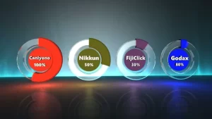
Unlike bar graphs or tables, pie charts are intuitive. When enhanced with 3D design and animation, they go from being just informative to emotionally engaging. Think of real-time poll results spinning into view. Or a product sales breakdown gently pulsing with color. This isn’t just data — it’s data with presence.
Real-time updates, visual movement, and depth perception make the 3D pie chart a natural fit for live events where attention spans are short, and impact must be instant.
The Real Challenge: Why Traditional Tools Fall Short
Try doing this in PowerPoint or OBS, and you’ll quickly hit a wall.
Most traditional tools weren’t built for real-time rendering, live data binding, or 3D depth. Even some modern animation suites require advanced knowledge of motion graphics or programming to get a pie chart to rotate, pulse, or update with real-time inputs.
That’s why broadcasters and streamers are turning to tools like WASP3D Xpress — software that’s purpose-built for live graphics with visual drag-and-drop functionality, real-time data hooks, and built-in animation engines, that too available for free.
What Makes a Pie Chart “Engaging”?
Here are a few key design principles that separate a good 3D pie chart from a great one:
- Motion Attracts: A subtle rotation or a “fill” animation creates visual interest. The chart looks alive.
- Color = Clarity: Colors need to be distinct, intentional, and meaningful. Don’t use a rainbow if the categories don’t warrant it.
- Depth Adds Emotion: The 3D extrusion of slices gives a tactile feel — it’s more than data, it’s experience.
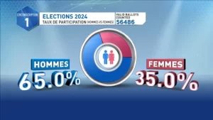
- Real-Time = Real Impact: Imagine a fundraising event where the pie chart updates live as donations come in — now you’re telling a story with data.
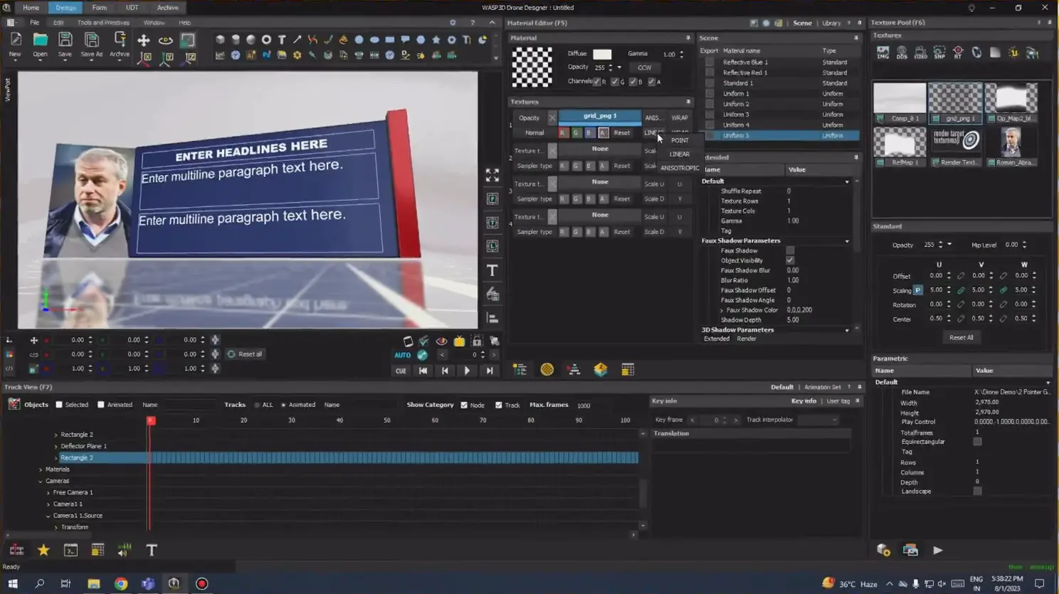
The Smart Way: Using Xpress to Build Your 3D Pie Chart
Xpress simplifies the whole process. Instead of scripting everything, you visually build your chart:
- Start with a Pie Template and link it to a User Data Table (UDT).
- Animate the slices to rotate, grow, or pulse as values change.
- Extrude the pie object to give it 3D depth — no plugins required.
- Wire your data directly to each slice and its corresponding text label, making updates seamless.
- Sync real-time data, so the chart updates dynamically during your stream.
- Add a base reflection layer to give it polish and realism.
- Use grouped elements like tiles and labels for legends — they update automatically as your data changes.
All of this can be done without a single line of code. That’s the beauty. Refer to this detailed tutorial to learn step by step, how to create a pie chart for livestreams
Use Cases: Where You Can Use 3D Pie Charts in Livestreams
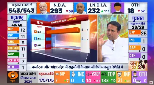
- News: Show election results or survey data in real-time
- Sports Streaming: Display match stats, player comparisons, or fan polls
- Live Events & Webinars: Share audience feedback or session analytics
- YouTube Live & Facebook Live: Show engagement metrics, polls, or monetization stats
- Corporate Presentations: Visualize sales data or performance metrics
- E-learning & Online Classes: Simplify complex data for better understanding
Pro Tip: Don’t Skip the Legends and Text Labels
A beautiful chart is useless if your audience can’t understand it.
Good data visualization isn’t just about design — it’s about clarity. Make sure your text labels are readable, and your legend actually explains the colors and values. Xpress allows you to bind text dynamically to your data so that the labels evolve as your numbers do — no manual updates mid-stream.
Final Touch: Add a Reflective Floor for Depth
If you’re going all in, don’t stop at 3D extrusion. Add a reflective surface below your pie chart. This small touch adds a cinematic feel, especially when combined with live lighting and motion.
In Xpress, this is just a matter of creating a base object, applying a uniform material, and turning on the reflection toggle. The result? A broadcast-ready visual that looks far more professional than your average stream overlay.
Conclusion: Your Data Deserves to Be Seen — Beautifully
In the attention economy, you’re not just showing information — you’re staging it.
A 3D pie chart may seem like a small detail, but it can create a big impact when used right. With the right tool like WASP3D Xpress, it’s easy to create graphics that don’t just tell — they compel.
So next time you go live, ask yourself: is your data just being shown… or is it being experienced?
FAQs
1. Can I use a Pie Chart for Your Livestreams on YouTube Live and Facebook Live?
Yes, you can easily use a Pie Chart for Your Livestreams on platforms like YouTube Live, Facebook Live, webinars, and live events. It helps you display real-time data like polls, stats, or results in a more engaging way.
2. Do I need coding skills to create a 3D pie chart for livestreams?
No, you don’t need any coding skills. Tools like WASP3D Xpress let you create a 3D Pie Chart for Your Livestreams using a simple drag-and-drop interface, making it perfect even for beginners.