Why Election News Overlays Matter
Election coverage is a battle for attention. Every channel is competing to keep viewers engaged as results trickle in. But audiences don’t just want numbers; they want context, clarity, and impact. News overlays bring life to election data, turning tallies into stories and statistics into visuals that spark conversations.
Breaking Down the Visual Toolkit for Elections
Election broadcasts demand a wide range of graphics, each designed to handle different layers of data and storytelling.
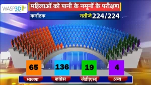
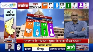
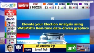
- Hemicycles & Seat Grids: Perfect for showing party-wise seat distribution in a parliament or assembly. As results flow in, the graphics update dynamically, instantly showing who is leading, trailing, or crossing the majority mark.
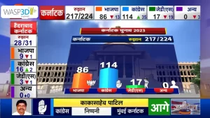
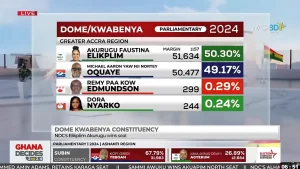
- Pie Charts & Bar Graphs: Ideal for percentage-based data like vote share, swing analysis, or turnout comparison across constituencies. Their animated transitions keep the narrative flowing without overwhelming the audience.
- Infographics: From demographic breakdowns to historical voting patterns, infographics allow anchors to explain the “why” behind the numbers.
- Video Walls & AR Elements: For large studios, video walls and augmented reality graphics turn results into immersive storytelling. Anchors can “walk through” a virtual map, zoom into regions, or stand beside a live-updating leaderboard.
- Virtual Sets (Vsets): Even broadcasters without big studio spaces can leverage WASP3D Virtual to create election environments. A simple green screen can be transformed into a buzzing newsroom or a full-scale election command center, giving smaller players the same edge as major networks.
The Role of Data in Election Graphics
At the heart of every election broadcast is data. Votes are counted at hundreds of centers, consolidated, and streamed to broadcasters—sometimes in real-time, sometimes manually. Graphics systems need to handle both.
- With WASP3D Pro, live election data can be directly integrated into graphics. As official feeds update, the visuals—hemicycles, charts, maps—refresh instantly on air. This makes Pro the go-to choice for large-scale broadcasters managing fast-changing results across multiple constituencies.
- With Xpress, smaller broadcasters can manually input data updates. While not fully automated, this ensures they still present live, professional-quality election overlays without needing complex infrastructure.
This distinction means every broadcaster—big or small—can find a solution suited to their needs. The common thread? Both platforms guarantee accuracy, speed, and stunning visuals.
Virtual Sets: Levelling the Playing Field
Traditionally, creating a state-of-the-art election studio required heavy investments in cameras, lights, LED walls, and physical infrastructure. But with virtual sets, even small studio holders can achieve the same high-impact results.
 https://wasp3d.com/livestream-graphics-overlay-solutions/wasp3d-virtual
Imagine a local channel using a single green screen but presenting elections from a futuristic newsroom, complete with a giant 3D election map in the background. With WASP3D Virtual, this is no longer imagination—it’s achievable with minimal resources. For audiences, the experience feels just as premium as watching coverage from a national broadcaster.
Enhancing Storytelling with 3D & AR for Election News Overlay
Numbers may tell the story, but 3D graphics and AR (Augmented Reality) make viewers feel the story. Picture an anchor standing next to a 3D bar chart that grows in real time as votes are counted, or walking across a virtual map where regions light up based on who is leading.
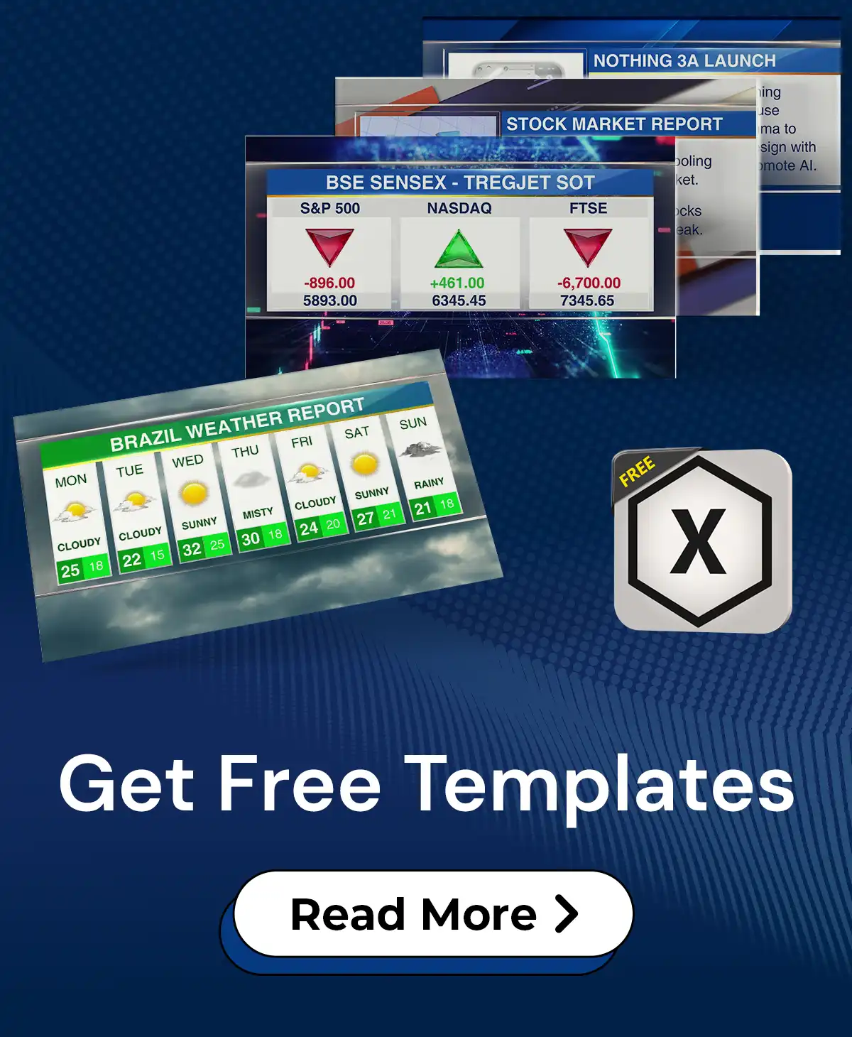
Why Free Tools Like Xpress Matter
Not every broadcaster has the budget of a national news network. Many local or digital-first players hesitate to invest heavily in election graphics, fearing high costs and technical barriers. This is where Xpress becomes invaluable.
It offers professional-quality election news overlays, ready to be used in live streams. Whether it’s a YouTube live session by a digital news outlet or a smaller TV station’s election night coverage, Xpress allows anyone to present with credibility and professionalism. With the ability to manually update data and use pre-designed templates, it bridges the gap between affordability and quality.
The WASP3D Advantage: Pro + Xpress + Virtual
- Xpress: Best for free election news overlays, easy manual updates, and quick adoption. Perfect for smaller broadcasters or online channels.
- Pro: A powerhouse for handling complex live data, automation, and advanced AR. Ideal for large networks managing national or state-level election coverage.
- Virtual: Unlocks professional studios for everyone, giving both small and large broadcasters the chance to present from world-class environments without heavy physical infrastructure.
Final Word
In today’s competitive media space, visuals are more than decoration—they are the language of trust. And with the right election graphics, every broadcaster has the power to speak that language fluently.