Election graphics have become one of the most important elements of modern election coverage. News channels are no longer limited to showing static result tickers.Today’s audiences expect immersive visuals, real-time constituency updates, dynamic seat maps, touchscreen-driven analysis, multilingual graphics, and continuous data synchronization across television, digital, and social media platforms.
Because of this shift, Election Broadcast Graphics workflows have become significantly more complex. During live counting, graphics systems must process thousands of changing data points every minute while maintaining rendering performance, visual consistency, and on-air accuracy. Even a few seconds of delay or a small graphics error can immediately affect viewer trust.
This is exactly why broadcasters frequently search for solutions related to:
- election graphics problems
- election broadcast graphics challenges
- live election graphics
- broadcast graphics software
The challenge today is not just about making graphics visually attractive. It is about building reliable real-time workflows that can survive high-pressure election environments without slowing down production.
In this article, we explore the most common election graphics challenges broadcasters face and understand how modern graphics workflows using solutions like WASP3D Xpress, WASP3D PRO, and Fluid DVE can help solve them more efficiently.
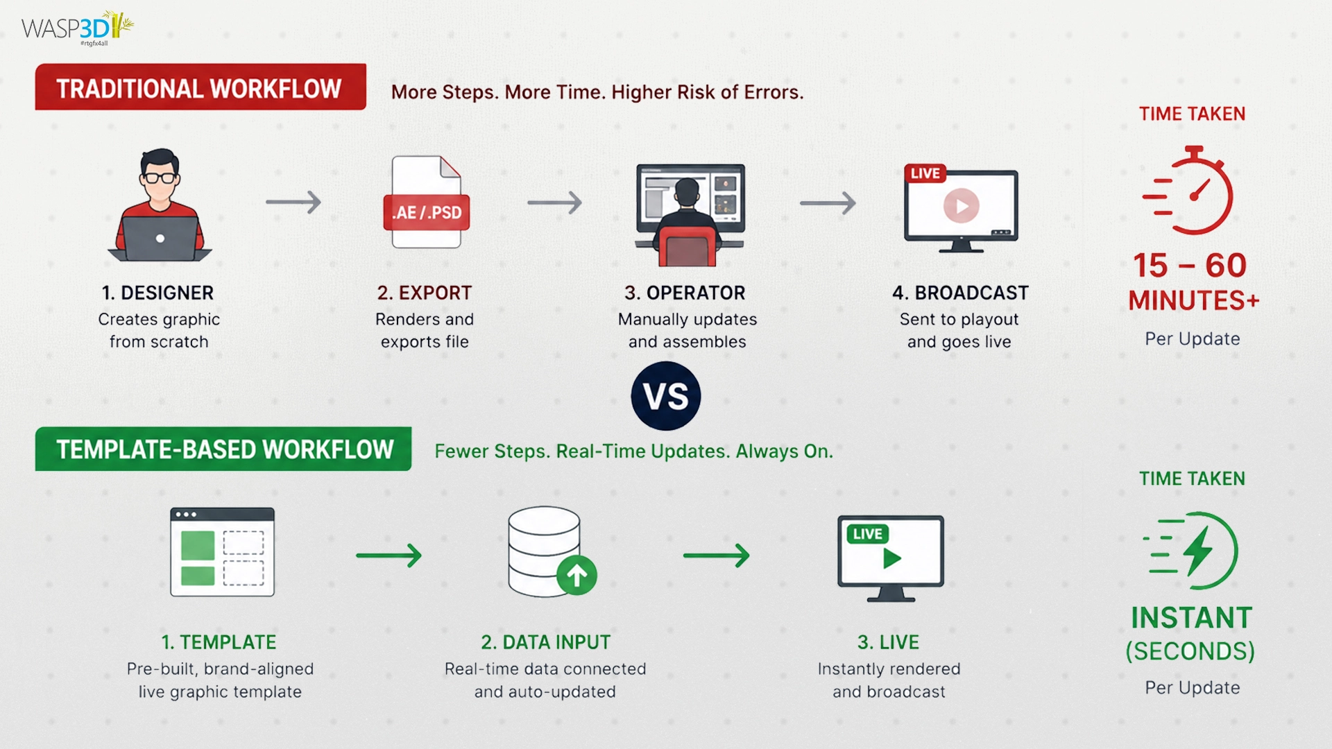
Challenge 1: Delayed Updates in Real-Time Election Graphics
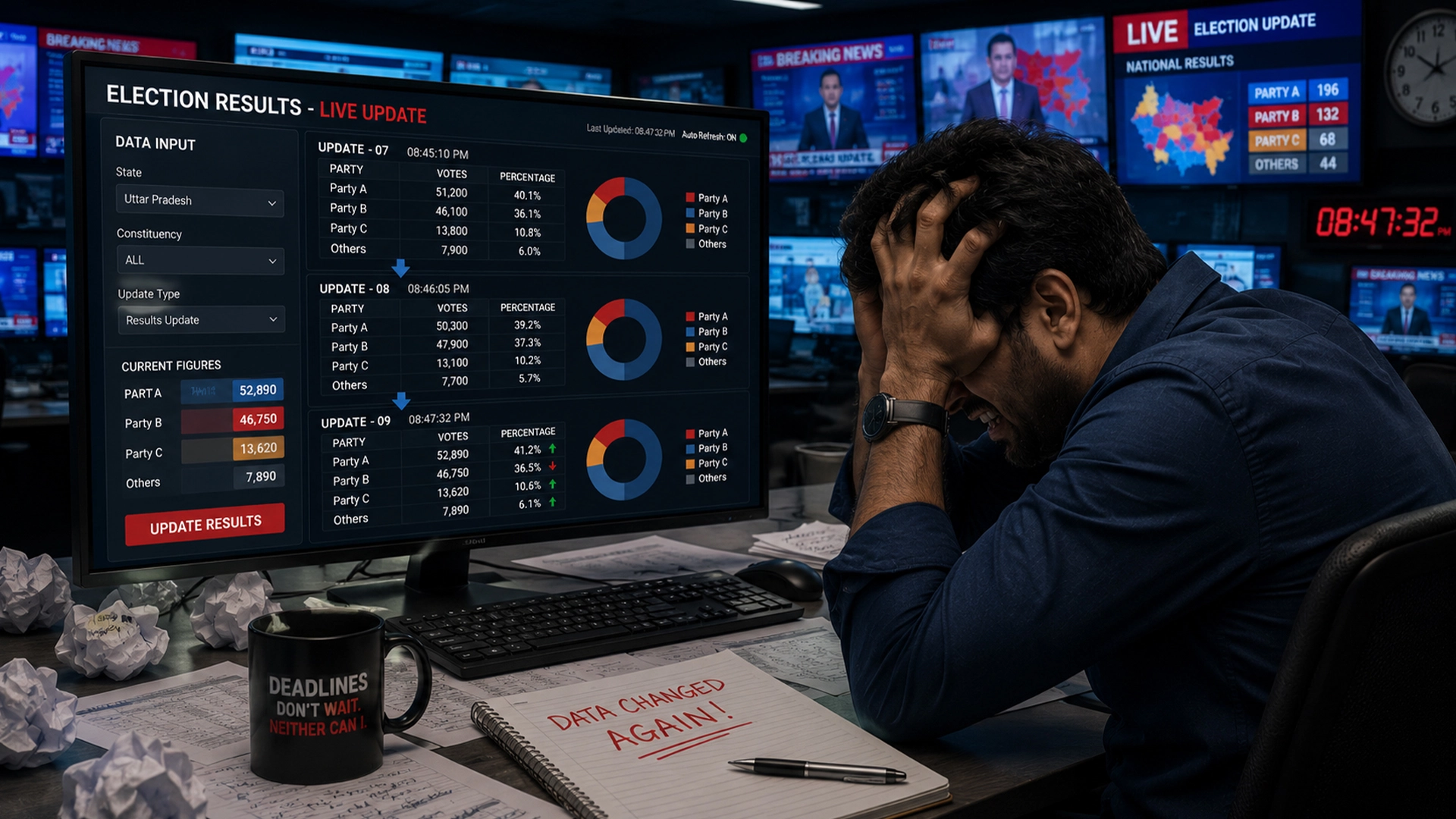
One of the most common issues during election coverage is delayed graphics updates. Anchors may already be discussing new constituency leads while on-screen graphics continue showing older numbers for several seconds.
This usually happens because many election workflows still depend on semi-manual processes. Graphics operators often refresh spreadsheets manually or trigger updates individually for seat counters, lower thirds, full screen graphics, and maps. During intense counting hours, this workflow becomes difficult to manage because election data changes continuously.
For viewers, these delays create confusion. If the newsroom reports one number while the graphics display another, the broadcast immediately appears unreliable.
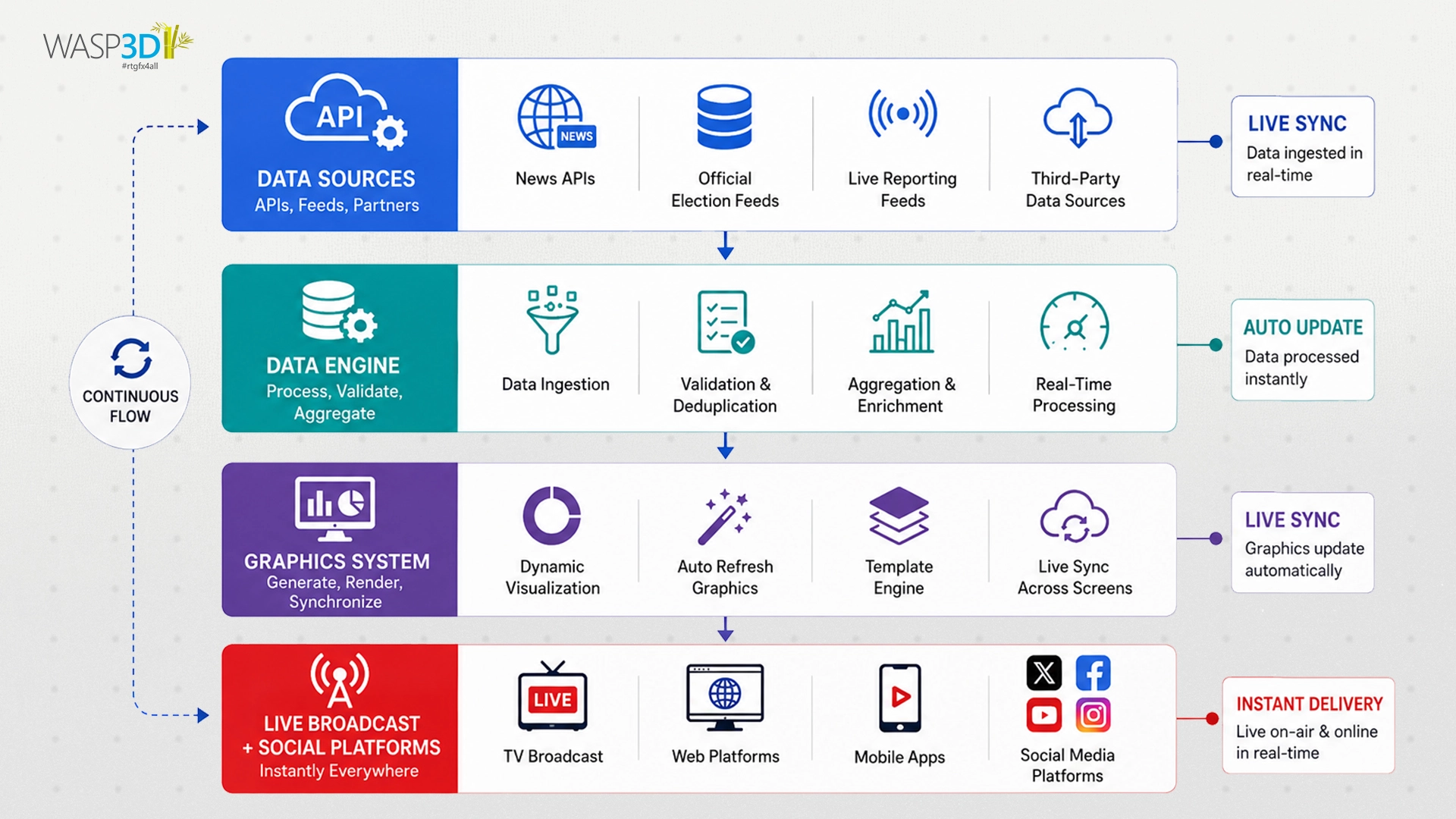
The solution is to build automated data-driven graphics workflows where election data updates dynamically without requiring repeated manual intervention.
WASP3D Xpress helps broadcasters simplify this process through template-based election graphics workflows connected with live data sources. Instead of manually rebuilding graphics repeatedly, operators can update constituency data in real time across multiple graphic outputs simultaneously. This helps reduce delays and improves synchronization between newsroom reporting and on-air visuals.
Challenge 2: Preventing Manual Data Entry Errors During Live Counting
Election broadcasts operate under extreme pressure. Graphics teams often work continuously for long hours while managing thousands of incoming updates. In such fast-moving environments, manual data entry errors have become extremely common.
Sometimes the wrong candidate appears as the leader. In other cases, vote margins are entered incorrectly party symbols of mismatch, or constituency names contain spelling mistakes. Even a single incorrect graphic during election coverage can spread rapidly across social media and damage the credibility of the channel.
This problem becomes larger during regional elections where multiple parties, alliances, and independent candidates are involved simultaneously. The ideal solution is to reduce manual dependency as much as possible by connecting graphics systems directly with centralized election databases.
WASP3D PRO supports data-driven graphics workflows where templates can automatically populate candidate names, party information, vote counts, and constituency details using connected live data sources. This reduces repetitive manual entry tasks and helps broadcasters minimize operational errors during high-pressure counting situations.
Challenge 3: Managing Complex Election Maps and Real-Time Graphics Rendering
Modern election storytelling depends heavily on animated seat maps and constituency visualizations. These graphics are no longer static images. They include dynamic lead changes, color updates, statistical overlays, transitions, charts, and multiple layers of data visualization. While visually impressive, these graphics are extremely demanding rendering systems.
During national election coverage, hundreds of constituencies may update simultaneously. Every lead change triggers map recalculations and visual refreshes. If the rendering pipeline is not optimized, broadcasters may experience lagging animations, frame drops, delayed updates, or complete graphics instability.
This is one of the biggest election broadcast graphics challenges because viewers rely heavily on maps to understand election trends quickly. The solution is to use graphics systems designed for heavy real-time rendering workloads.
Challenge 4: Managing Multi-Language Election Graphics Across Regions
Election coverage in multilingual countries creates another major operational challenge. News broadcasters often produce election graphics in several regional languages simultaneously, including Hindi, English, Tamil, Telugu, Bengali, Marathi, Kannada, Gujarati, and Malayalam.
Managing separate graphics workflows for every language becomes extremely difficult. Different fonts, varying text lengths, alignment changes, and translation updates often break graphics layouts during live broadcasts.
Many broadcasters still create separate templates for every language variation, which increases duplication and operational complexity. The smarter approach is to use flexible template-based workflows capable of handling multilingual graphics dynamically.
Challenge 5: Managing Long Candidate and Party Names Across Election Templates
One of the most overlooked Election data graphics problems involves long candidate names and alliance titles breaking graphic layouts.
Election graphics templates are often designed around predefined text lengths. However, during live elections, broadcasters frequently encounter the following:
- unusually long constituency names
- coalition titles
- regional party names
- independent candidate names
- multi-party alliance labels
When templates are not responsive, text overlaps logos, breaks alignment, or becomes unreadable on-air. Graphics operators then waste valuable time resizing layouts manually during live broadcasts. This issue can be solved through adaptive graphics templates capable of automatically adjusting layout behavior based on text length.
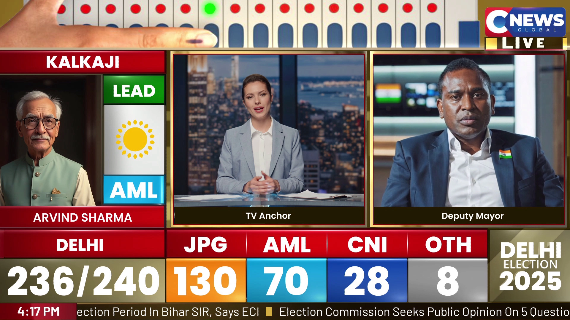
Challenge 6: Synchronizing Election Data Across Multiple Broadcast Platforms
Election data appears across multiple visual outputs simultaneously:
- seat counters
- fullscreen graphics
- scrolling tickers
- constituency maps
- touchscreens
- social media graphics
- LED wall displays
One of the biggest operational challenges is ensuring that every platform displays the same numbers at the same time.
Without centralized synchronization, mismatches become common. A ticker may show one seat count while the touchscreen display shows another. These inconsistencies immediately reduce viewer confidence. The solution is centralized data orchestration where all graphics outputs pull information from a common election data source.
Challenge 7: Managing Real-Time Election Map Updates During Lead Changes
Election maps continuously change colors as leads shift between political parties during counting rounds. While this sounds simple, it becomes technically difficult when updates occur every few seconds across hundreds of constituencies.
Many graphics systems struggle to process these rapid updates smoothly. As a result, broadcasters experience delayed map refreshes, temporary color mismatches, or animation stuttering during live broadcasts. Since constituency maps are often the centerpiece of election storytelling, even small delays become noticeable to viewers immediately. The best solution is to optimize rendering pipelines specifically for high-frequency election updates.
This improves update responsiveness and helps maintain smoother election visualization workflows during peak counting periods.
Challenge 8: Preventing Election Graphics Freezes During High-Volume Data Updates
HTML5 and browser-based graphics systems have become increasingly popular because of their flexibility and integration capabilities. However, during election coverage, browser-based graphics engines often struggle under continuous data pressure.
Election broadcasts involve:
- nonstop data polling
- animated charts
- dynamic graphics updates
- multiple rendering layers
- continuous transitions
- simultaneous data visualization tasks
Under heavy loads, browser graphics systems may freeze, slow down, or crash completely. This has become one of the fastest-growing election graphics problems in modern broadcasting. The practical solution is to combine flexible graphics workflows with rendering systems capable of handling demanding real-time broadcast environments.
Challenge 9: Managing Complex Touchscreen Election Analysis Workflows
Touchscreen election analysis has become a major part of modern news broadcasting. Anchors now interact with live maps, constituency data, party statistics, and trend visualizations directly on large displays during coverage. While these presentations improve audience engagement, they also create operational complexity behind the scenes.
Broadcasters often face problems such as:
- delayed touchscreen responses
- inconsistent data synchronization
- overloaded graphics scenes
- slow transitions between election views
- cluttered multi-window presentations
Managing multiple data windows and visual layers smoothly during live analysis segments requires highly organized graphics workflows.
Fluid DVE can help broadcasters create more structured and visually controlled election presentation environments through dynamic multi-window compositions, animated transitions, and layered election graphics arrangements. Instead of abruptly switching between graphics scenes, broadcasters can create smoother visual transitions between constituency views, party dashboards, and election analysis screens. This improves presentation flow while helping anchors navigate election data more efficiently on-air.
Challenge 10: Managing Large Volumes of Election Graphics Templates Efficiently
Large-scale election coverage generates an enormous number of graphics variations. Broadcasters often create separate templates for:
- different states
- multiple political parties
- regional languages
- winner graphics
- seat projection scenarios
- alliance combinations
- breaking news alerts
- constituency-specific layouts
Over time, this creates hundreds of duplicate templates inside graphics systems. Managing these files becomes difficult during live broadcasts because operators waste time searching for correct versions or updating multiple templates individually. This problem slows down production significantly during high-pressure election coverage.
The smarter solution is to move toward reusable modular graphics structures instead of maintaining duplicate layouts repeatedly.
Best Election Graphics Software for Modern News Broadcasts
As election coverage becomes more data-driven and visually demanding, broadcasters are increasingly searching for the best election graphics software capable of handling real-time production workflows efficiently.
Modern election production requires much more than attractive visuals. Broadcasters need systems capable of:
- real-time data-driven graphics
- live constituency updates
- scalable election templates
- rendering-heavy election maps
- synchronized graphics workflows
- multilingual election graphics
- responsive layouts
- fast graphics deployment
This is where dedicated broadcast graphics software platforms become essential.
WASP3D solutions are widely used in broadcast workflows because they support scalable election graphics production environments without forcing broadcasters into overly complicated pipelines.
For example:
- WASP3D Xpress is useful for template-driven election graphics workflows, real-time data integration, and rapid graphics generation during live counting.
- WASP3D PRO is more suited for complex and rendering-intensive election graphics environments involving large-scale visual data presentation and advanced election visualization workflows.
- Fluid DVE helps broadcasters create visually organized election presentation layouts using dynamic multi-window compositions and smooth transition workflows during live analysis segments.
As election broadcasts continue evolving, broadcasters increasingly need graphics systems that can balance speed, scalability, reliability, and visual storytelling simultaneously.
Conclusion
Modern Live election graphics workflows are far more demanding than traditional television graphics environments. Broadcasters today must manage continuous real-time data updates, multilingual graphics operations, rendering-heavy constituency maps, synchronized visual outputs, and highly dynamic election presentations simultaneously.
As election coverage becomes faster and more immersive, traditional graphics workflows are increasingly unable to keep up with operational demands.
Challenges like delayed updates, rendering instability, browser overloads, synchronization mismatches, and template management issues are now common across the industry. These are no longer minor technical inconveniences they directly affect broadcast quality, newsroom efficiency, and viewer trust.
That is why broadcasters are increasingly investing in advanced broadcast graphics software solutions capable of supporting scalable and data-driven election production workflows.
WASP3D Xpress, WASP3D PRO, and Fluid DVE each help address different aspects of election graphics production from template management and live data-driven graphics workflows to rendering-heavy election visualization and dynamic multi-window presentation control.
As audience expectations continue to rise, broadcasters that modernize their live election graphics infrastructure will be better prepared to deliver faster, more reliable, and more visually engaging election coverage across every platform.
FAQ
1. What are election graphics?
Election graphics are visual elements used to display vote counts, seat tallies, constituency results, maps, and election trends during live election coverage. They help viewers understand complex election data quickly and accurately.
2. What are the biggest challenges in election graphics?
Common election graphics challenges include delayed data updates, manual data entry errors, map rendering issues, multilingual graphics management, and maintaining consistency across multiple platforms during live coverage.
3. Which software is used to create election graphics?
Broadcasters use specialized election graphics software to create real-time election visuals. WASP3D PRO supports data-driven election graphics, automated result updates, constituency maps, and live election dashboards for professional broadcast environments.
4. How can broadcasters automate election graphics updates?
Election graphics can be automated by connecting graphics templates to live election data sources. Solutions like WASP3D PRO allow vote counts, candidate information, and seat trackers to update dynamically without repeated manual intervention.
5. Why is data-driven election graphics software important?
Data-driven election graphics software improves accuracy, reduces manual errors, and ensures real-time synchronization across maps, tickers, full-screen graphics, and touchscreen election analysis tools. This helps broadcasters deliver more reliable election coverage.